A few days ago, I ran into a little problem when using SVGs. I'd created a reusable set of SVG symbols for a project I was working on, and started sprucing it up with all the pretty icons my designer gave to me. As we all know, one of the biggest benefits to using SVG is the “scalable” part of it, meaning that graphics render perfectly at and size, no matter the original size of the graphic. I'm a huge fan in general of SVG, and implementing them into this project was a no brainer for me.
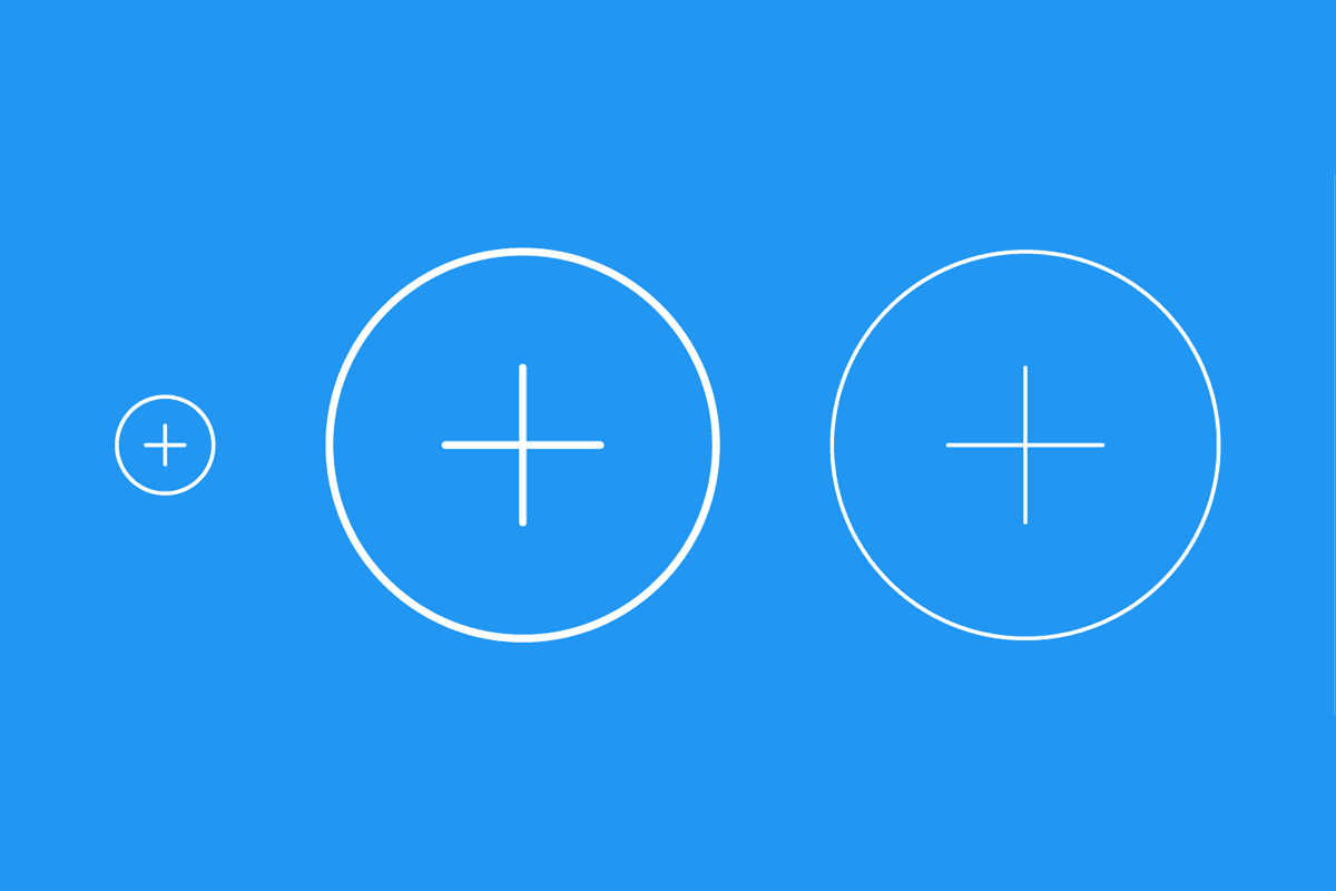
However, a few of the icons in the design consisted of strokes, and those strokes were always 1px in width, no matter the size. When you scale an SVG, it scales everything about it, so an icon that's scaled up two times would have stroke widths that are double the size of the original. One such example was a “+” icon that indicated there was more content. I had to reuse that icon at small and large sizes, but:
- I wanted the stroke width at all sizes to be
2px - I wanted to create one graphic that I could reuse at any size without scaling the stroke width
Enter The Vector Effect Attribute
One of my favourite things about programming is being faced with a problem. It challenges you to research and find solutions. In this case, I stumbled upon the vector-effect attribute, which conveniently has non-scaling-stroke as one of its values. It does exactly what it says, i.e. prevents strokes from scaling as an SVG scales.
My original SVG symbol looks something like this:
<!-- reusable symbols -->
<svg>
  <symbol id="Icon-plus" viewBox="0 0 50 50">
    <circle cx="25" cy="25" r="20" fill="none" stroke="#fff" stroke-width="2"/>
    <path d="M25 15 L 25 35" fill="none" stroke="#fff" stroke-width="2" stroke-linecap="round"/>
    <path d="M15 25 L 35 25" fill="none" stroke="#fff" stroke-width="2" stroke-linecap="round"/>
  </symbol>
</svg>

<!-- actually using the symbol -->
<svg width="50" height="50">
  <use xlink:href="Icon-plus"/>
</svg>
Notice how the viewBox dimensions are perfectly aligned with the width and height dimensions. With this version of the icon, the 2px wide stroke displays at 2px, as expected. However, if I reuse that icon elsewhere at a bigger size, like this:
<svg width="200" height="200">
  <use xlink:href="Icon-plus"/>
</svg>
I'd see a scaled up icon including scaled up effects. This one's dimensions are 4 times the size of the original view box. As such, the stroke would render at 8px. In order to circumvent this, I added the vector-effect attribute to the paths on the original graphic, and set the value to non-scaling-stroke, like this:
<circle vector-effect="non-scaling-stroke" />
<path vector-effect="non-scaling-stroke" />
<path vector-effect="non-scaling-stroke" />
Now, at any size, the stroke would render at 2px as desired!
Wrap Up
And that’s a wrap! I really wanted to share this simple tip with you as it's served me beautifully in recent times. Thanks again for reading, and if you have and questions, comments, or feedback, feel free to get in touch.